01 — Discover
Research & Empathy
The original project was delivered through stakeholder discussions, requirement analysis, design exploration, and engineering collaboration.
Deliverables
01 — PT. GDC Multi Sarana · Nov 2022 – Feb 2024
End-to-end product design for a mobile e-wallet that scaled to 50,000+ active users, with a focus on trust, clarity, and onboarding retention.
Overview
GDC Multi Sarana needed a consumer e-wallet that could compete in an already crowded Indonesian fintech market. Users in Tier 2 and Tier 3 cities were skeptical of digital financial products, often abandoning onboarding at the identity verification step. The existing prototype had a 72% onboarding drop-off rate and lacked the trust signals required for first-time digital banking users.
Own the complete design lifecycle — from discovery research through to developer handoff. Build a design system from scratch, validate every major flow through usability testing, and deliver an experience that makes digital financial services feel safe and intuitive for users who had never used an e-wallet before.
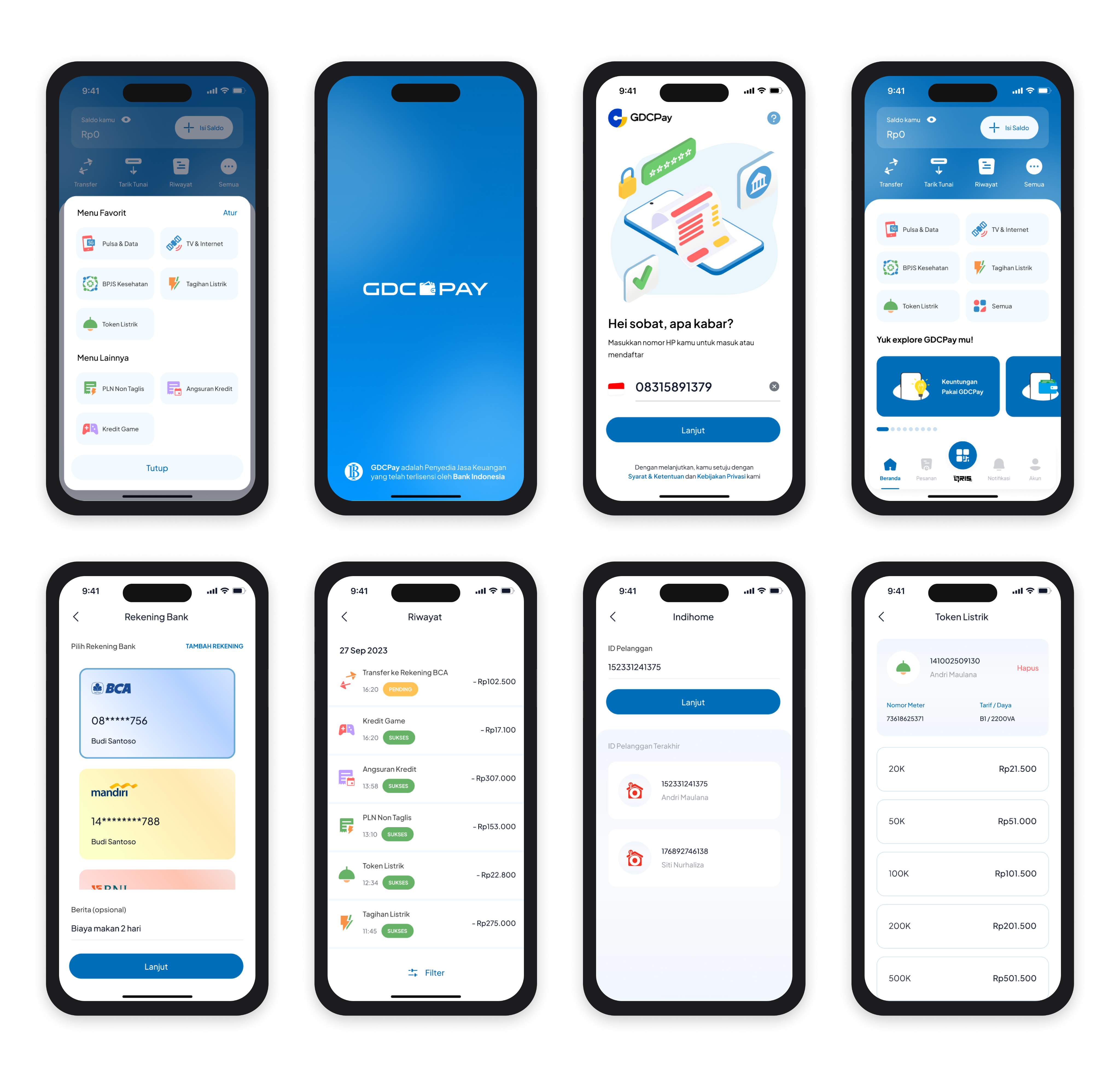
Product screens
Process
01 — Discover
The original project was delivered through stakeholder discussions, requirement analysis, design exploration, and engineering collaboration.
Deliverables
02 — Define
Synthesised research into 3 core problem statements around onboarding trust, transaction clarity, and error recovery. Created a revised information architecture that reduced top-level navigation items from 9 to 4 and mapped 23 critical user flows covering registration, P2P transfer, top-up, and bill payment.
Deliverables
03 — Design
Built a complete design system in Figma with 140+ components covering typography, colour tokens, icon set, form states, and motion guidelines. Produced high-fidelity prototypes for all core flows. Prioritised micro-interactions for loading, success, and error states to build subconscious trust in financial contexts.
Deliverables
04 — Deliver
Ran 3 rounds of moderated usability tests with 8 participants each. Iterated on payment confirmation UI after discovering users misread the fee breakdown. Delivered annotated Figma files with developer-ready specs, asset exports, and a 32-page interaction documentation to the engineering team.
Deliverables
Impact
Reflections
In fintech for first-time users, every micro-interaction either builds or erodes confidence. We learned to treat loading states, error messages, and confirmation dialogs as primary design surfaces — not afterthoughts.
Three rapid usability test cycles were more valuable than one polished design phase. The payment confirmation issue we caught in Round 2 would have cost significantly more to fix post-launch.
Investing 6 weeks in the component library upfront allowed us to move 4× faster in the second half of the project and gave engineering a consistent, predictable handoff.